

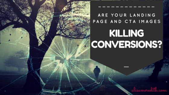

What Works in Landing Page and CTA Images
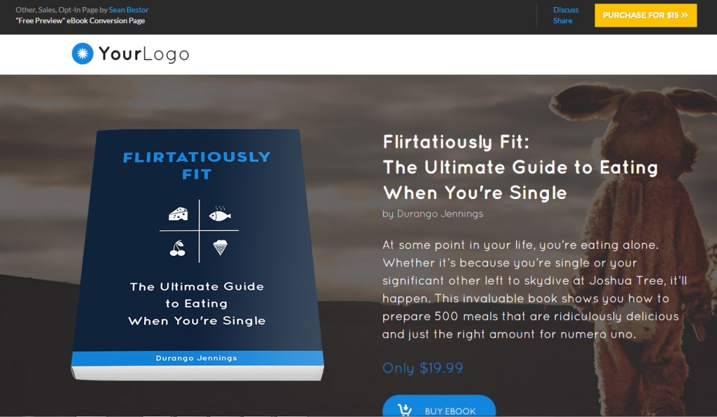
Here’s a landing page template available from LeadPages. They know what converts. Now, while the bunny suit may be an odd choice, you can see what they were going for here. Showing in image of the book, even though we all know it is an ebook and won’t really look quite like that, helps people understand the value of what they’re getting.
Now, notice the CTA to sell the LeadPages template product – the color contrasts beautifully with the rest of the content on the page. Yellow/orange is a great choice for a site or a page with dominant blue colors. Just think opposites on the color wheel and make your CTAs contrast, but not clash, with the overall color scheme of your site.


Connect Your CTAs and Your Landing Pages with Consistency
If your CTA button on your blog features soft pastel colors, puppies, and sunshine, but then you click and see a landing page with fireworks and rock and roll, that’s a disconnect that is likely to drive you away – and fast.
While you don’t have to use the exact same images in your CTA as on your landing page, the style, messaging, and even the wording should be consistent. So, if your CTA promises “10 Ways to Increase Blog Traffic” and your landing page offers, “Best Ways to Get More People to Your Site” – visitors will be confused (is this a mistake?) and trust breaks down (did I just get the bait-and-switch?). You’re not getting their email address!
Here’s a great example from HubSpot of a CTA in a blog post:


Which leads to this landing page: 
If you take a look at your CTA and landing page images, do you see the connection without even trying? Ask a friend to take a look. If anything creates a mental disconnect, fix it now and watch your conversions explode!
Pin Me?


Related articles across the web


Latest posts by Alisa Meredith (see all)
- How Much Do Pinterest Ads Cost? - December 10, 2021
- Surround Sound Marketing – The Content Strategy of the Future - November 29, 2021
- How to Build Your Business with Word-of-Mouth Marketing - November 18, 2021