 You have your riveting title, your easy-to-skim text, your well-thought out points and your SEO ducks in a row. But you’re not quite ready to publish yet! Not until that blog post has an image – or two or three! There are two major reasons why, if you want them to see the light of day, every blog post needs an image.
1. People Love Pictures on Websites! Google Loves What People Love.
I know, this should NOT need to be said. However, how many times have you clicked a link to an interesting-sounding blog post and found a page completely devoid of visual interest. Did you stay? Do you think your content is so amazing that someone else would? Give your incredible content the fighting chance it deserves by including a captivating image on every single post and every single page of your website. No exceptions, please.
Want to improve your SEO and search rankings? Consider this: Google wants to return the best search engine results possible. That way users will continue to search on their platform and business owners will continue to spend money on ads on Google. Google is smart enough to see if people are finding what they want on your site. Since what they want includes images, make sure to include them.
2. Social Media Users Love Pictures and Will Share Them.
Some business owners report getting more traffic and leads from social media than from search engine and direct traffic combined. By a lot. Since visuals do so well on social, you’ll find your blog posts get a lot more mileage when you include good ones!
Tweets with Images = More Website Traffic
The power of a good photograph or image is undeniable. Add a couple of words and you can convey paragraphs of meaning in one beautiful little package. Not convinced that this translates into any real KPIs? Well, check this out:
[clickToTweet tweet=”Tweets with images receive 18% more clicks than those without!” quote=”Tweets with images receive 18% more clicks than those without!”] (source)Oh, and retweet and favorite numbers go way up (150% and 89% respectively) when you use an image, too. Would you like people to share links to your content on Twitter so that people will click through to your site? Then make sure you always provide an eye-catching visual to go with it.
Pinterest – Obviously
Even casual users of Pinterest are reporting a large amount of traffic from Pinterest to their websites. Make it easy for people to pin by providing an image that looks great on Pinterest. That means a large, portrait-oriented image, usually with a headline right in the image – AND with the alternate text on the image making a good pin description. That way people don’t have to change the default “image-of-dog-with-ball.jpg” into the more appealing (and more likely to result in clicks” “How to teach your dog to play fetch in three minutes or less.” Increase odds of a click through to your article by including a link to the post right in the pin description!
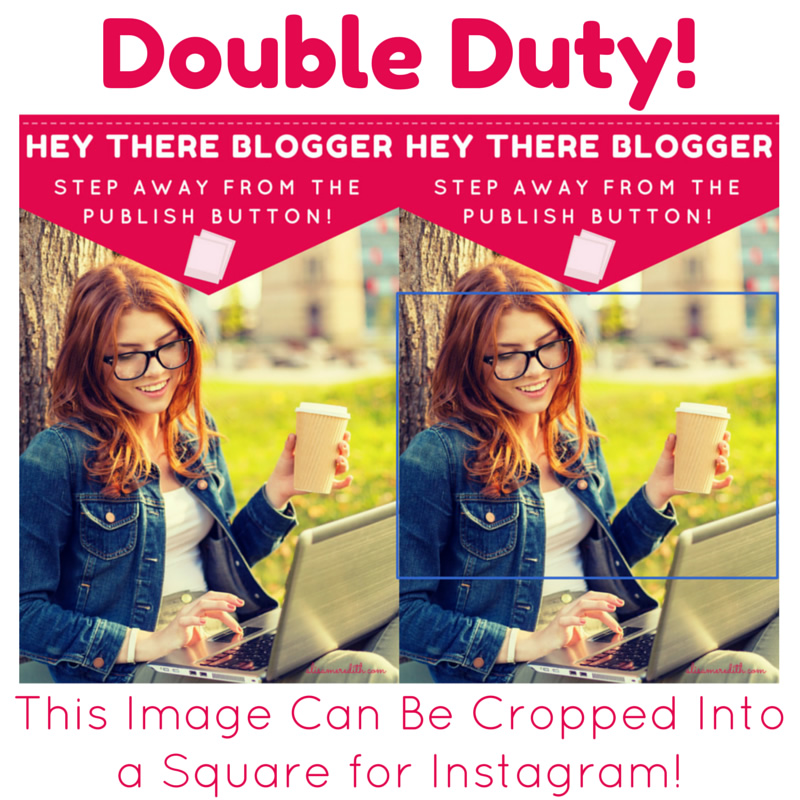 While Instagram might be considered more of an awareness tool than a traffic driver, you can get website visitors from Instagram. Include a link in your bio and consider updating Instagram with images from your blog posts. You might even make Instagram-specific images, since what does well there is not the same as what will take off on Facebook and is, in fact, almost the exact opposite of what does well on Pinterest (in terms of colors, filters, etc.).
Don’t Feel You Have to Stop at One Image!
If one image is good, two relevant images is better. Why? Well, for one thing, it makes for better readability, keeping people on your site longer (Google notices). For another, it gives people an option of what to share on social. One image may really hit home with a reader while another makes no impression at all. While you can do your best to make all your images outstanding, increase your shares by providing more options whenever possible.
What If I’m a Terrible Designer?
Canva. Just use Canva. It’s free and it’s dead simple and beautiful. Start with templates and add your own images and tweak things a bit. Still no magic? Hire me to do it for you. Seriously. Call 910.498.8585 or email alisa@alisameredith.com.
Expert Tool Tip: Social Warfare!
Portrait for Pinterest, landscape for everyone else. Warm for Pinterest, cool for Instagram. So, how do you choose? Well, I have two templates in Canva – one for Pinterest and one for everyone else. When creating a Pinterest image, I try to compose it so that it can be cropped in a square for Instagram. I prioritze Pinterest, so my images and filters do better there, but at least I have an image for both.
What about on your blog though? How do you get people to share the “right” image on the right platform? If you use WordPress, buy the Social Warfare plugin now. You can specify one image for Google+, Facebook, and LinkedIn with another for Pinterest. Neither image has to be shown in the body of the text (but you should have images in there, of course!). You’ll be able to make a custom pin description, custom tweet, social media title and description. Don’t feel like doing ALL that? It will fill out default information based on your post title, which is going to be better than what you’d have otherwise!!!!
Related Articles:
- Visual Content Marketing Strategy
- The Power of Twitter’s New Expanded Images and How to Make the Most of It
Pin Me:
