 We love getting more likes, saves, and followers, but for most of us, the ultimate goal of Pinterest is to get people to our sites where they’ll take some action that brings them closer to being our next happy customer. So, what kinds of pin images and descriptions work best for driving traffic? Let’s dive in!
It should be noted that these tips apply to both organic pinning and when promoting pins for advertising. So, here’s are 8 tips for creating pins that drive traffic.
1. Use Multiple Product Images on Your Pin
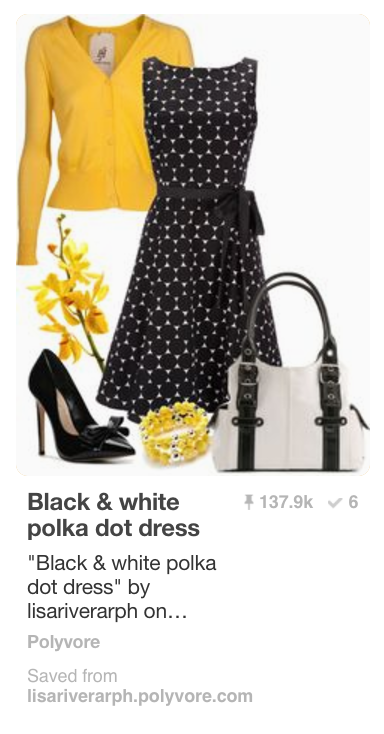 Using multiple images means your pin will appeal to a wider audience and encourage more clicks. You can either show variations on similar items (a shirt in multiple colors, for instance) OR you can show how several items work well together.
Make sure the pin links to a page on your site where the pinner can find ALL of the items in the pin. For instance, if you pin an outfit image, create a sales page on your site where the visitor can add ALL those items to their cart from the same page.
2. Use a Mix of Lifestyle AND Product Photos
 People want to be able to picture your products in their (imaginary, much-improved) life. So, put them to use in your photos and make them come alive. To clarify exactly WHAT you want them to notice, you can put images of the individual items below your lifestyle image.
3. Make them Tall and Narrow
This is Pinterest 101, but it’s still so true – and so underutilized. Using a ratio of 2:3 works well for Pins, though some pinners have found making even taller pins works well. Why do tall images work better? Because of the real estate they consume in the feed! Better visibility will increase clicks.
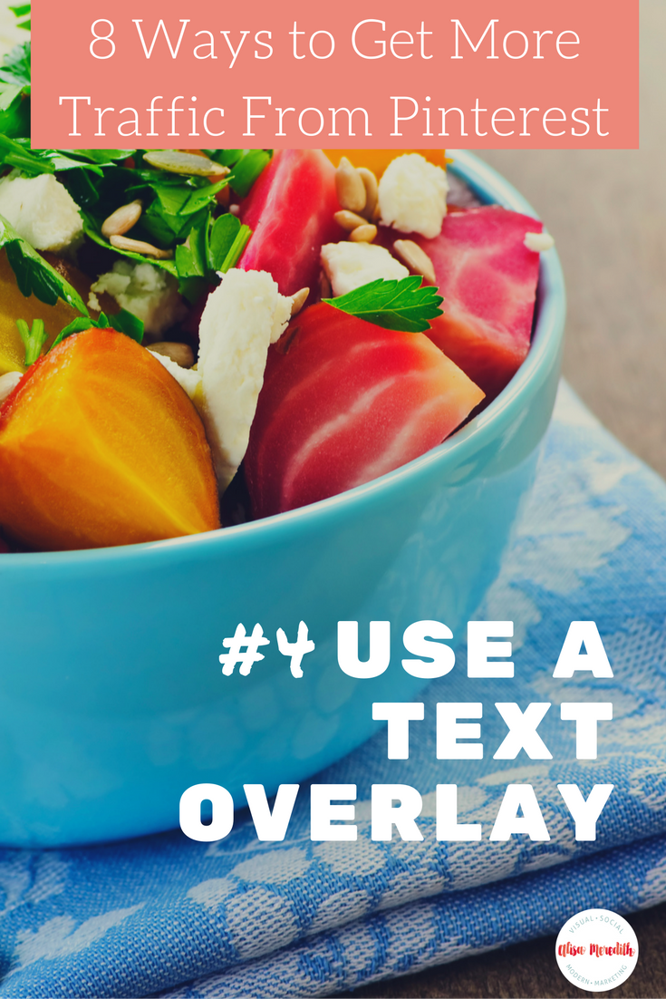
4. Use a Text Overlay
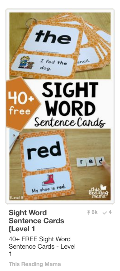 Entice people to click with thoughtful text on the image. Make sure it’s large enough and the font is clear enough that it will be easily read by pinners on mobile.
As with most marketing messages, think about “what’s in it for me?” from the perspective of those you want to click. Will the content help them save time, lose weight, be smarter, save money, make their family happier? Show them with words why they simply HAVE to click and learn more.
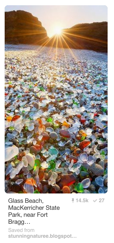
It should be noted that there are a TON of very popular pins that do not use text overlays. However, without that extra hint about the linked content, it’s hard to say why they are popular.
The example at right is a very popular pin, but this gorgeous image gives me no reason to click on it. If you were using an image like this to promote your Glass Beach Resort, you’d want to make sure people knew it!
5. Rethink Infographics
Infographics are fabulous for getting more saves (repins). However, they don’t always bring in the website traffic because most of the time, everything you need is right ON the pin. Even if the accompanying website page or blog post provides a lot more information, most people won’t notice.
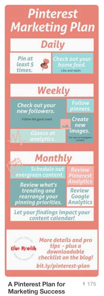 This is not to say that infographics are not good for Pinterest. Of course they are! They’re just not always the best choice when you’re trying to increase website traffic.
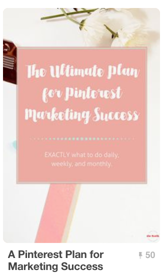 For example, I have an infographic that was doing quite well on Pinterest organically. I decided to promoted it. It got a great number of saves, but the clickthrough rate was a lot lower than I wanted it to be. So, I started promoting the blog post’s Pinterest image and it has a 54% higher clickthrough rate!
However, it has only about one third the save rate as the infographic, so I’m letting them both run. Free saves can equal more free traffic in the long run.
6. Write Good Descriptions
You may have noticed that Pinterest has been decreasing the number of description characters we see in our feeds. At last count I figured it about 80 characters. That’s 2/3 of a tweet! So, put your compelling “why you must click” at the beginning of your description or they may never get to it. Use compelling words like, “download now” “shop” “make” “find” “buy” to prime people for action.
If you use Rich Pins, be aware that that rich pin description may be all a pinner sees unless they click on the pin. So, consider adding a compelling CTA to that field on your blog or product listings as well.
7. Be a Tease
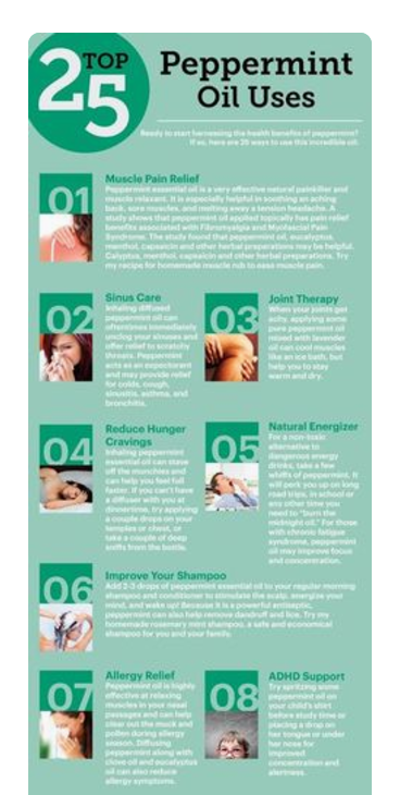
Remember, giving away your secrets on a pin is a great way to get repins, but it’s NOT the best way to get traffic. Instead, give a little taste of what they’ll get when they click – and make sure they know it!
For example, do you have a blog post that outlines 10 Ways to Boost Your Productivity? If so, create one pin for the entire article, and then make a pin for each of the 10 ways. Condense the tip down into a pin-sized snack and tease on the image and/or in the description that this is just one of the 10 tips.
You might even number them. For example, the text on image 3 could be “Productivity Tip #3: Put everything on your calendar.” Just having that #3 tells pinners that there are more little gems to be found in your content.
I’ve done this for four of the tips in this post. Hit the pin it button in your browser to see them all. I put them in the post, but then put this bit of code before the images (in text view in WordPress): <div style= “display: none;”> and this bit after </div>. There’s a handy video here.
8. Show a Step-by-Step
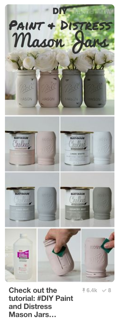
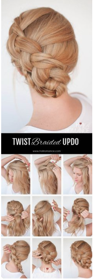 Showing the end result and then a step-by-step of how to get there can give people a sense of “OK, I can do this!” and may encourage them to click through for more details or perhaps a video. Make sure you don’t give it ALL away in the pin, though.
There are many great examples of recipe, craft, and hairstyle pins that do this. Even if your recipe has all the ingredients listed because it’s a rich pin, the home chef still needs to click through to your site to get instructions on putting it all together.
If website traffic is the goal of your Pinterest marketing, put all of these tips to work and watch your referrals rise!
Related Posts
Latest posts by Alisa Meredith (see all)
- How Much Do Pinterest Ads Cost? - December 10, 2021
- Surround Sound Marketing – The Content Strategy of the Future - November 29, 2021
- How to Build Your Business with Word-of-Mouth Marketing - November 18, 2021
